
milo
As a social media intern for milo, an LA-based fashion brand, my work spanned both content creation and web design, two sides of the same goal: make the brand feel as elevated online as it does in person.
On the content side, I worked alongside the founder to build a grid that feels as intentional as the brand itself. Product shots, lifestyle moments, and reels to tease collections so the page reads less like an online store and more like a look book. Each post was placed with the next one in mind, alternating between close product detail, styled lifestyle shots, and a multi-image mood collage to keep the grid from reading flat or repetitive.
On the web side, I gave the Shopify site a design refresh that filled in content gaps and gave the brand more room to tell its story. Adding the "as seen in" section brought press features from Forbes and Fashionista onto the homepage, giving new visitors immediate credibility. An Instagram photo section tied the brand's social presence directly into the site. Updated SEO across the site, paired with the content strategy overhaul, helped grow Instagram from 700 to 2,605 followers in seven months, alongside a rise in website traffic.
Work included: Built and managed a strategic content calendar and posting schedule from scratch, developed content pillars to guide ongoing content creation, social media content creation, Instagram grid curation, Shopify web design, SEO updates, and press section buildout.
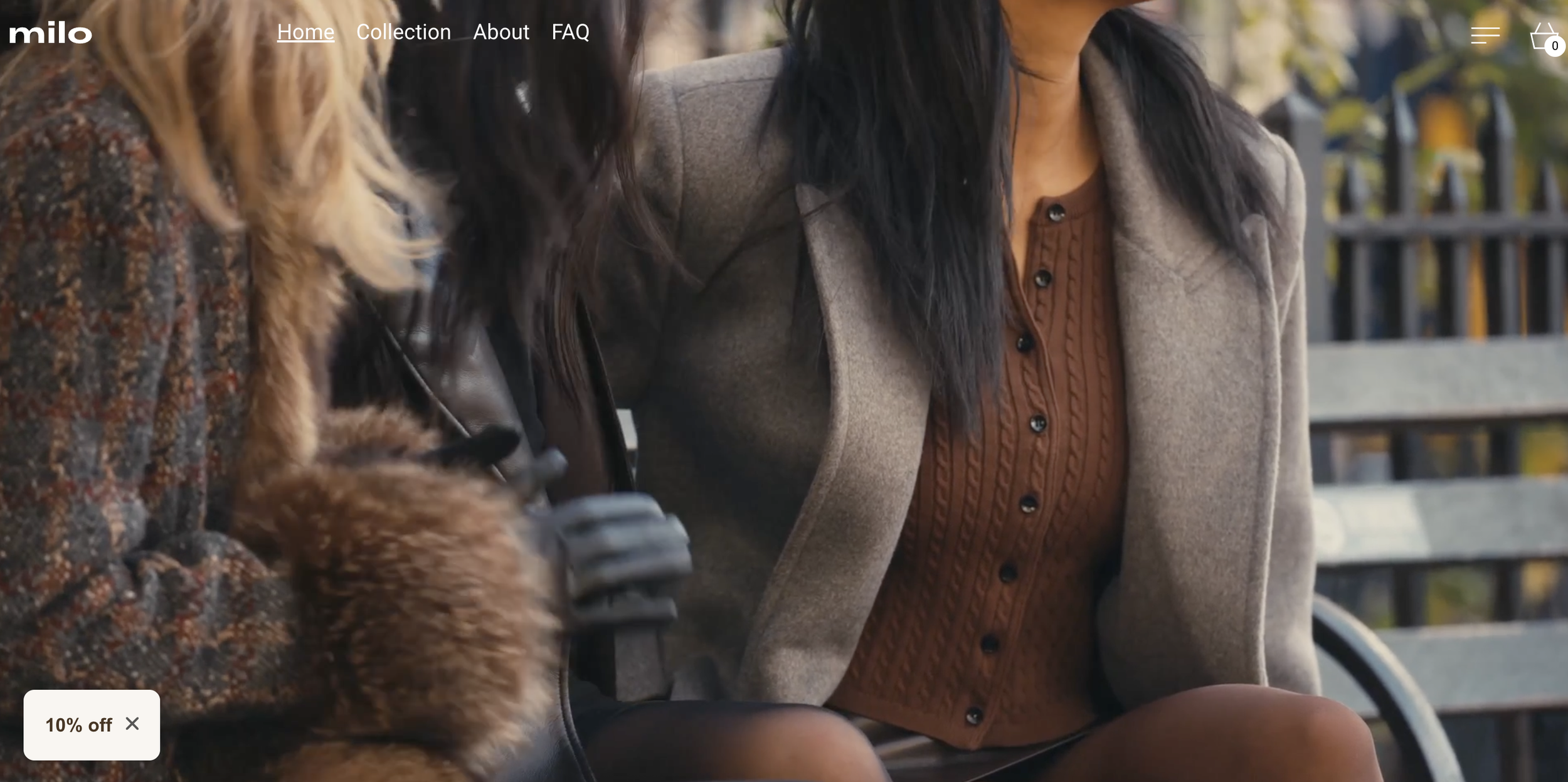

View the brand live:
Instagram: @milo.maison
Website: milo.maison
Working with Kenzie has been such a wonderful experience. She is incredibly kind, thoughtful, and genuinely invested in the vision behind the work she does. Rather than simply completing tasks, she takes the time to understand the heart of a brand and approaches every project with the goal of bringing that vision to life.
One of the things I appreciate most about her is how well she takes direction while also taking initiative. She’s attentive, dependable, and always looking for ways to contribute beyond what’s asked of her. Whether she’s helping with our website or supporting our social media, she consistently approaches every detail with care and a desire to make the work stronger.
What really sets her apart is her commitment to growth. She’s constantly learning, expanding her skill set, and taking it upon herself to improve so she can bring even more value to the companies she works with. That level of ownership, curiosity, and dedication is rare, and it shows in the quality of her work.
I would wholeheartedly recommend her to anyone looking for someone who is not only talented and hardworking, but who truly cares about the success of the people and brands she supports. She’s an incredible asset, and I have no doubt she’ll continue to make a meaningful impact wherever she goes.
Kimmy Paladini
Client Review
Wanderlust Outfitters
On the content side, I shot and edited short-form video, created static posts and stories, wrote captions, and assisted with product photoshoots. On the operations side, I managed incoming product from brands like Patagonia, The North Face, and KUHL, wrote and updated product descriptions, and fixed site issues as they came up.
The role taught me how much of a retail brand's online presence depends on unglamorous groundwork. Every product photo, every caption, every fixed broken link is part of what makes a storefront feel trustworthy, even when no one notices the work happening underneath it.
Work included: short-form video concepting, filming, and editing, caption writing, photoshoot assistance, product image management, product description writing, signage and flyer printing, and website troubleshooting.
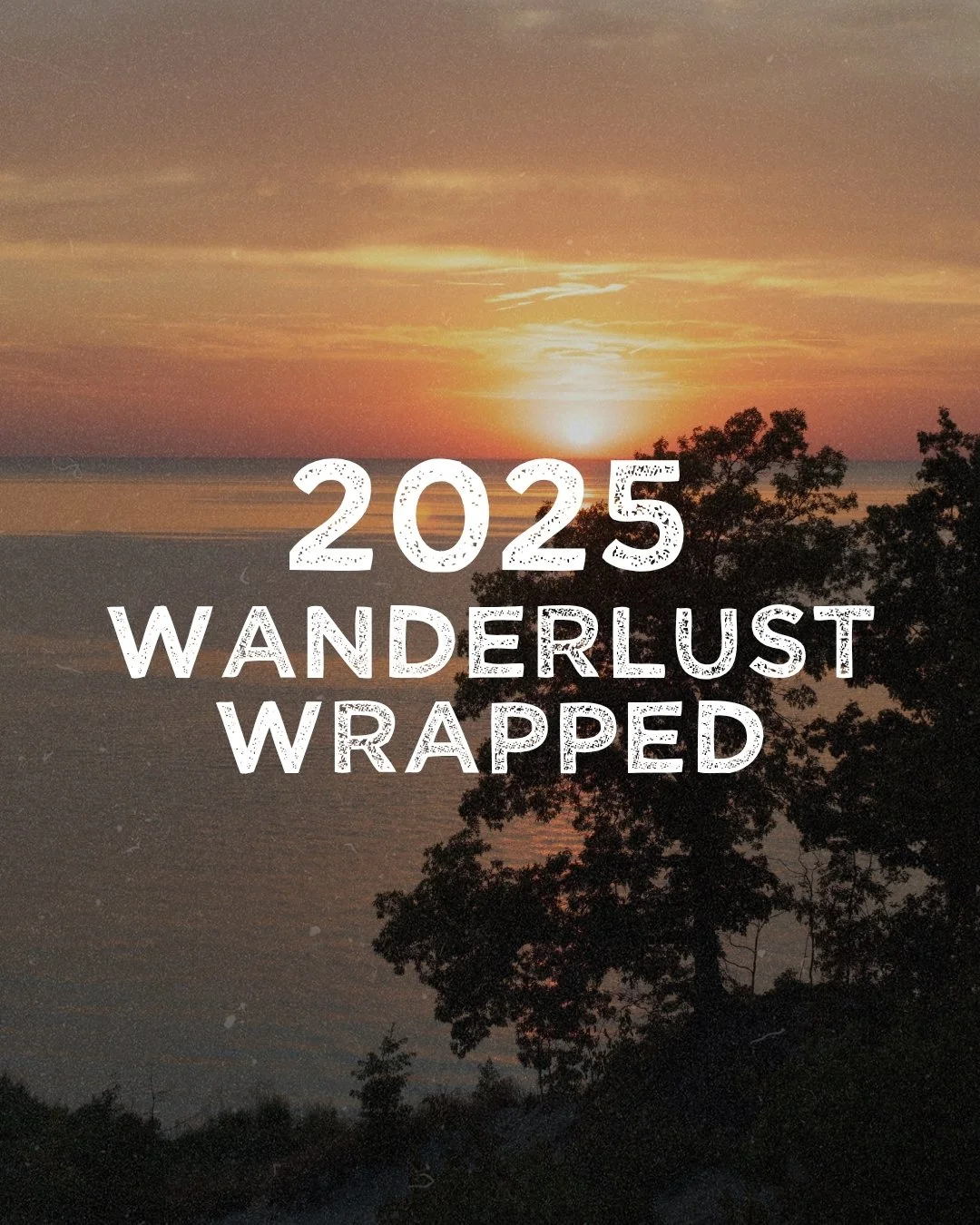
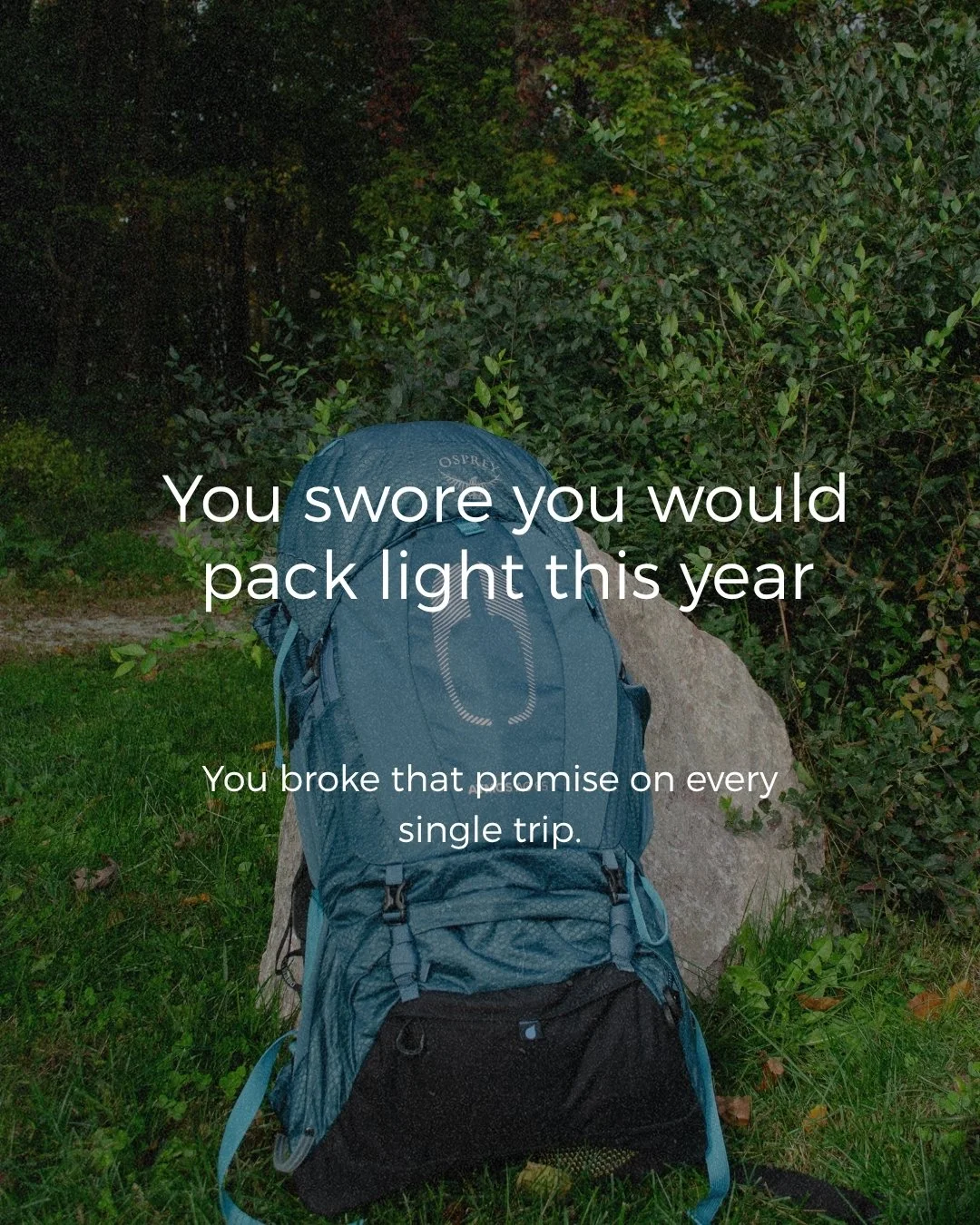
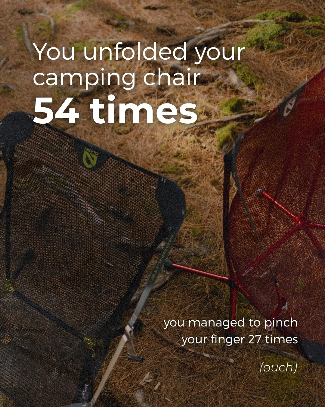
A "Wrapped" style New Year's carousel, a playful year-in-review built around outdoor culture inside jokes: camping chair unfold counts, the packing light promise that never holds, the finger pinches nobody warns you about.
The concept borrows the Spotify Wrapped format and applies it to gear and trip habits instead of streaming data.
Work included: concept development, copywriting, and slide design for a multi-image Instagram carousel.
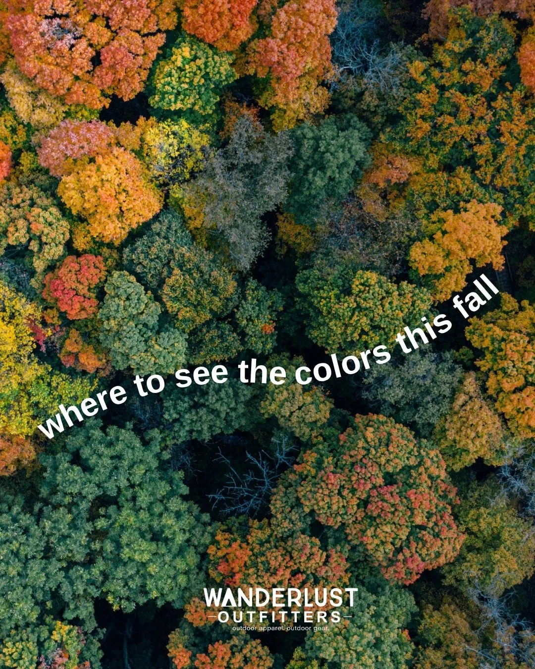
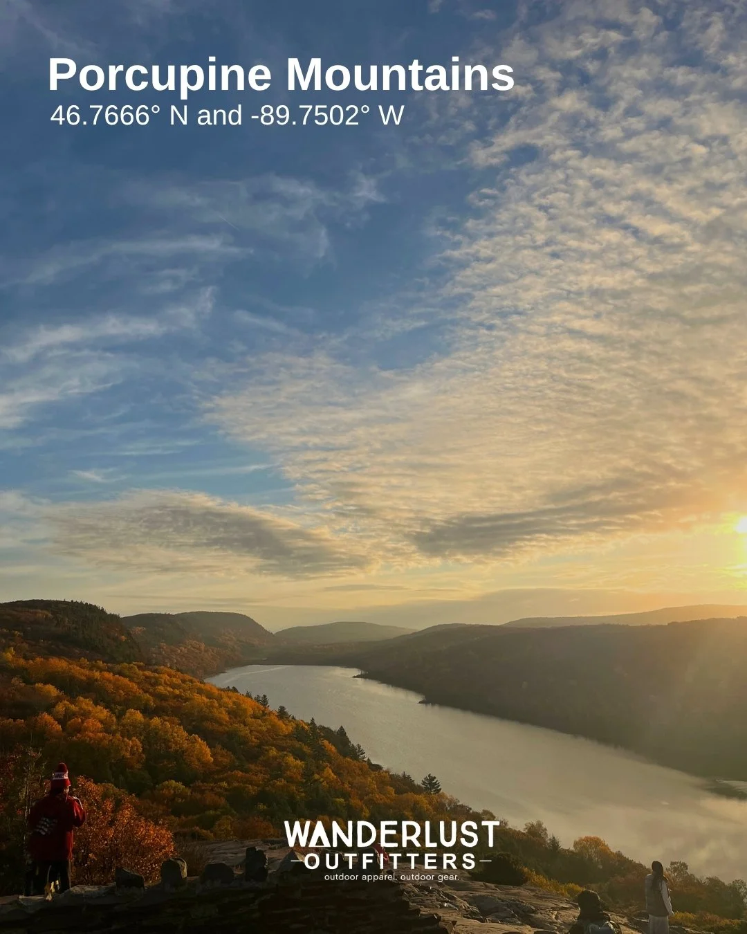
A fall foliage carousel spotlighting Michigan's best color spots: Mackinac Island, Pictured Rocks, the Porcupine Mountains, and Tahquamenon Falls. Each slide pairs the location name with its exact coordinates.
The concept ties directly into the brand's outdoor identity, using real Michigan geography to give the content a sense of place instead of stock photo scenery.
Work included: concept development, copywriting, and slide design for a multi-image Instagram carousel.
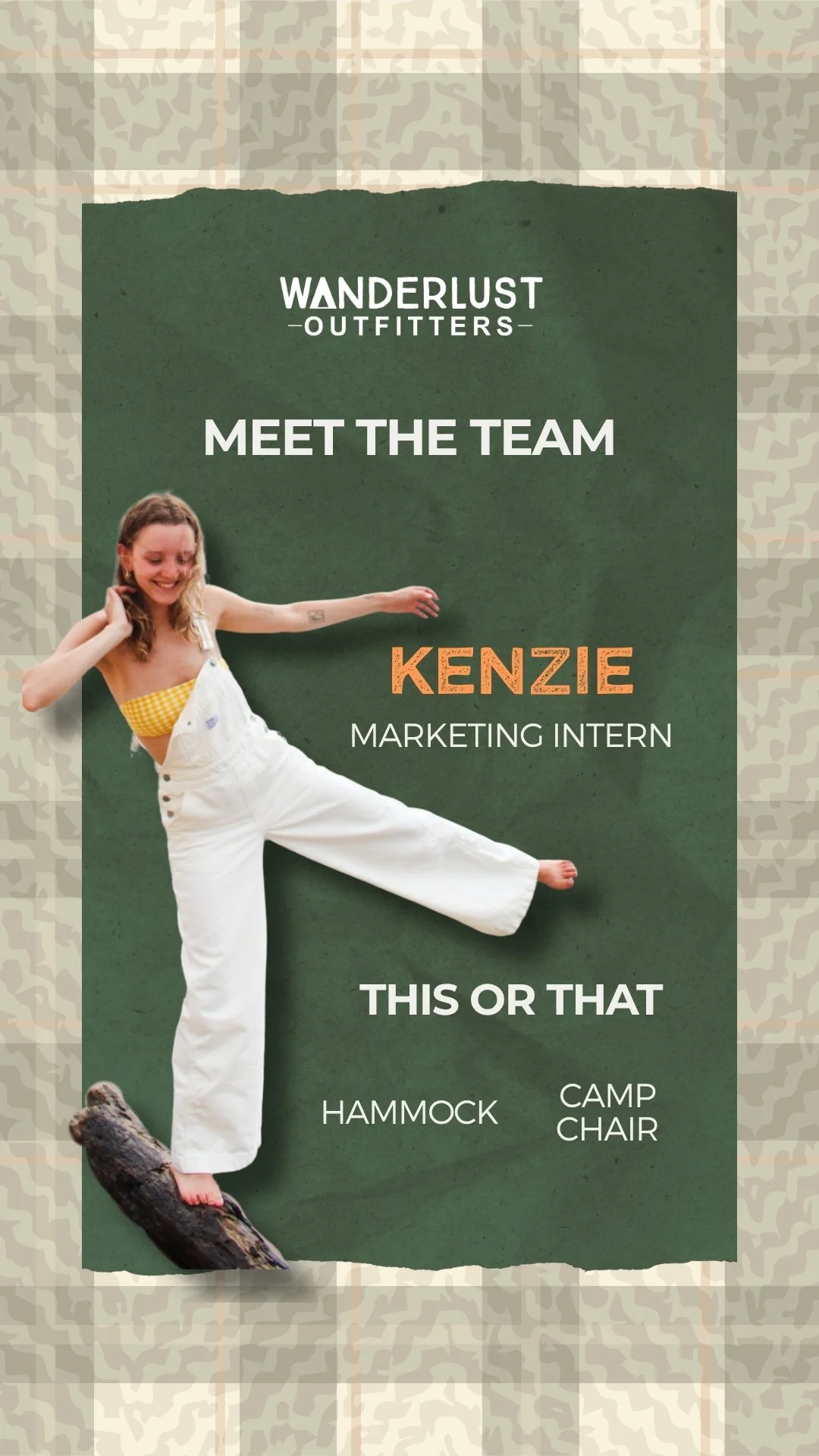
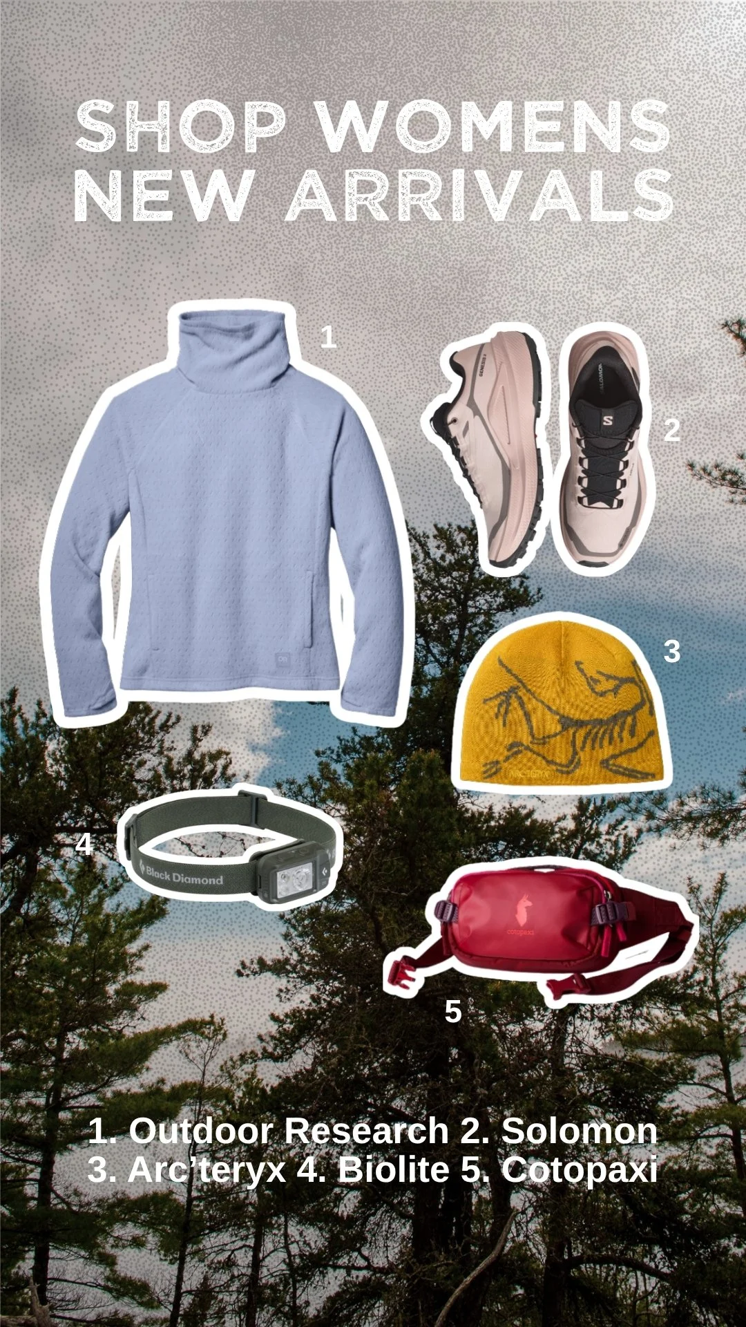
Set of Instagram Story graphics, including a "Meet the Team" intro and new arrival roundups for both men's and women's product lines. Each design used a distinct visual treatment: a torn paper and plaid background for the team intro, and a numbered, cutout product layout for the arrivals stories, so each felt purpose-built rather than pulled from the same template.
The new arrival stories were designed to work as a quick shoppable reference, pairing product images with a numbered key.
Work included: concept development and graphic design for a multi-story Instagram set.
Photography
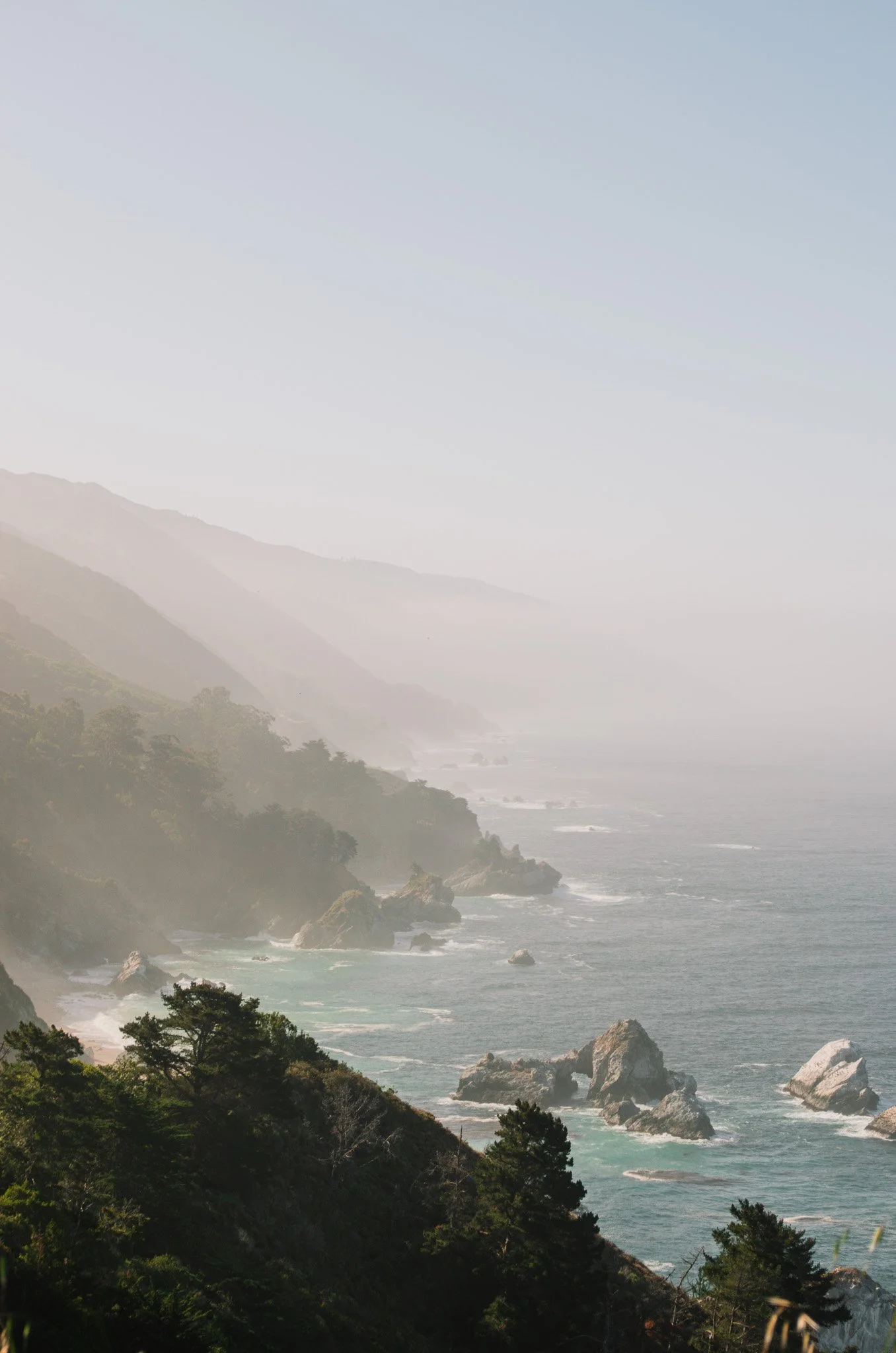
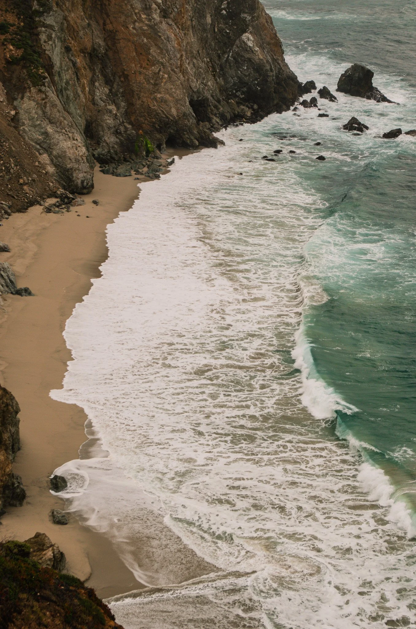
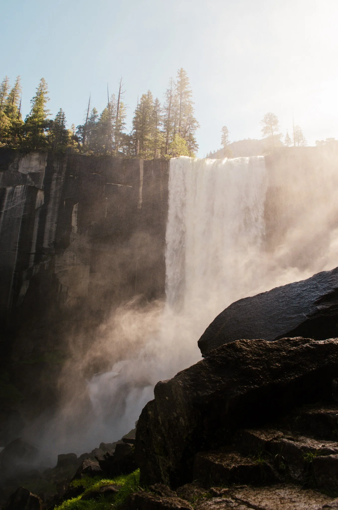
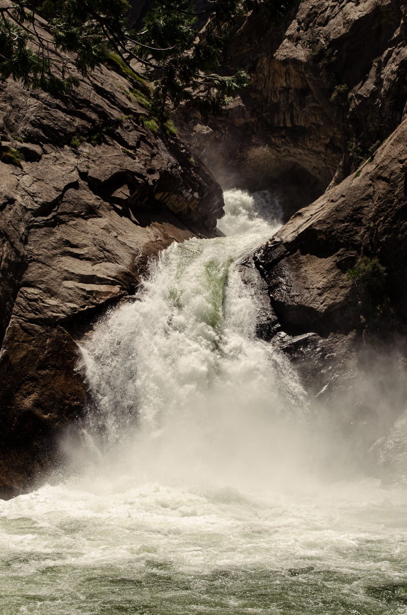
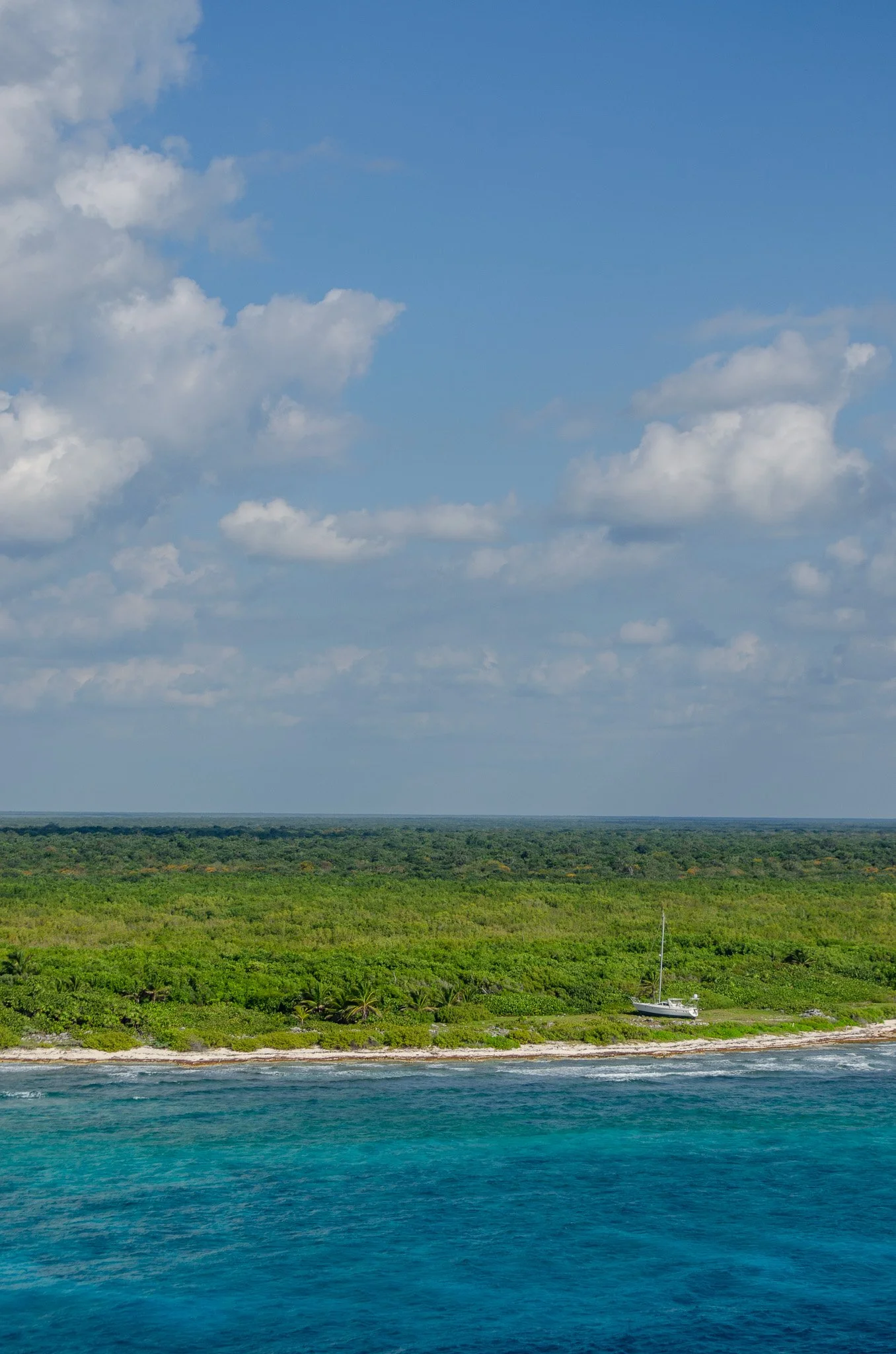
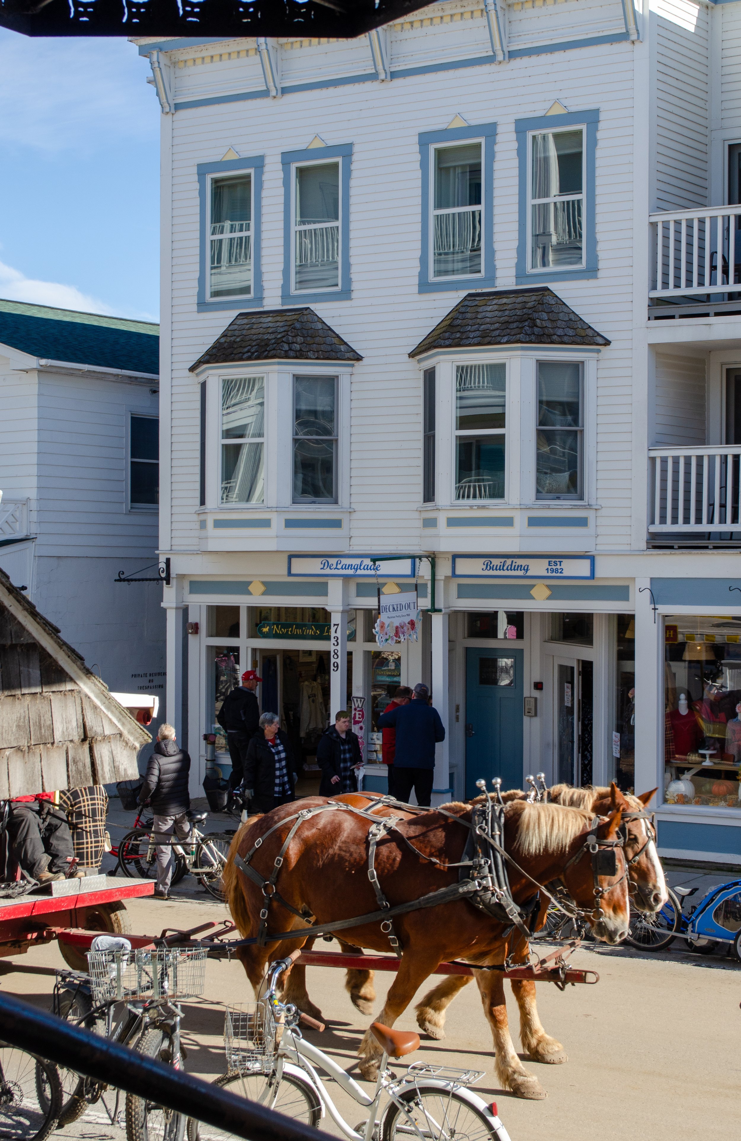
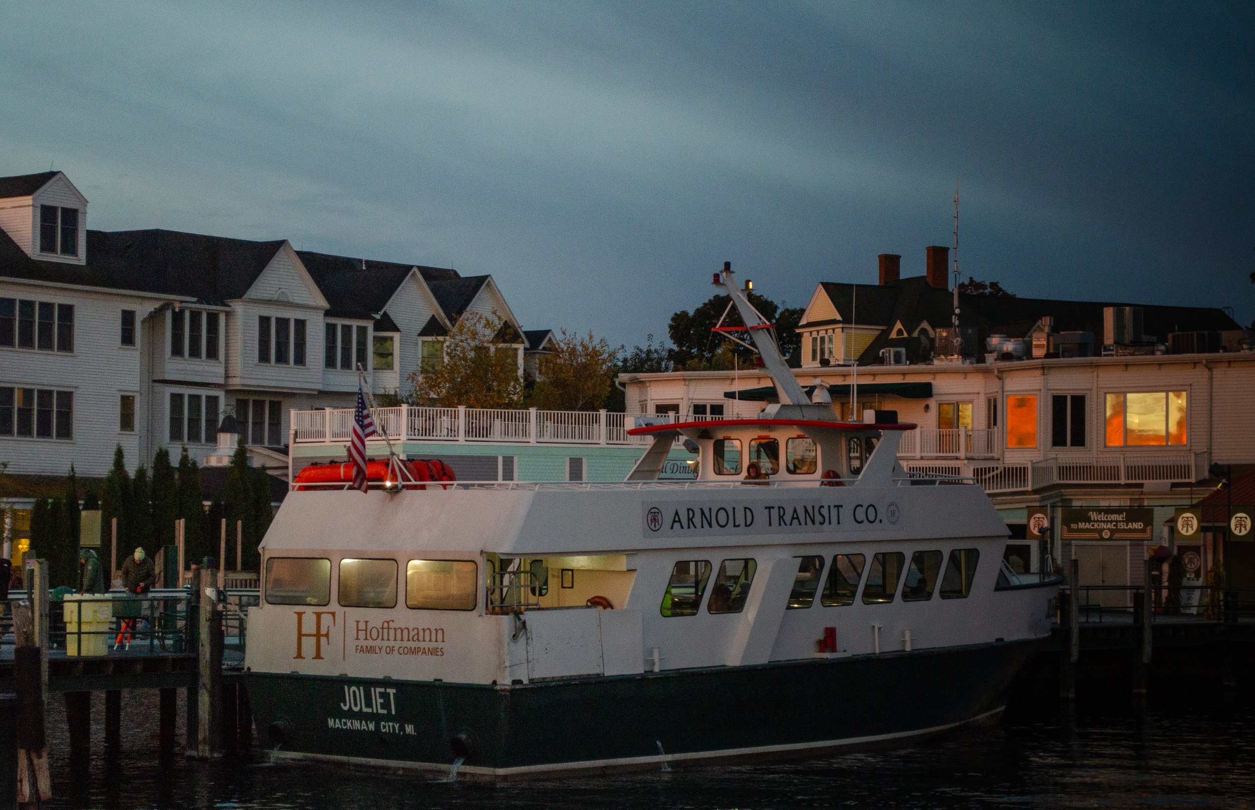
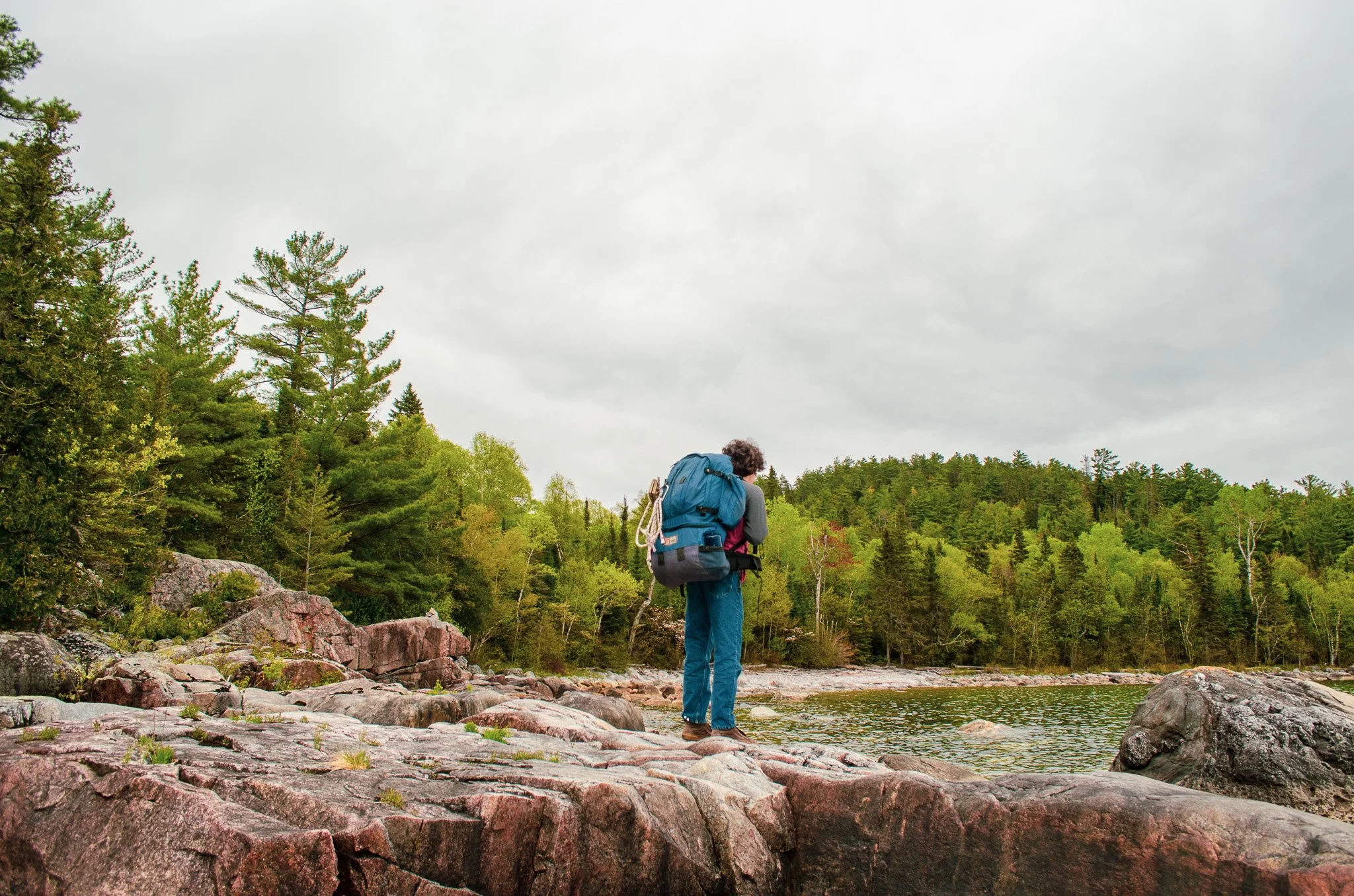
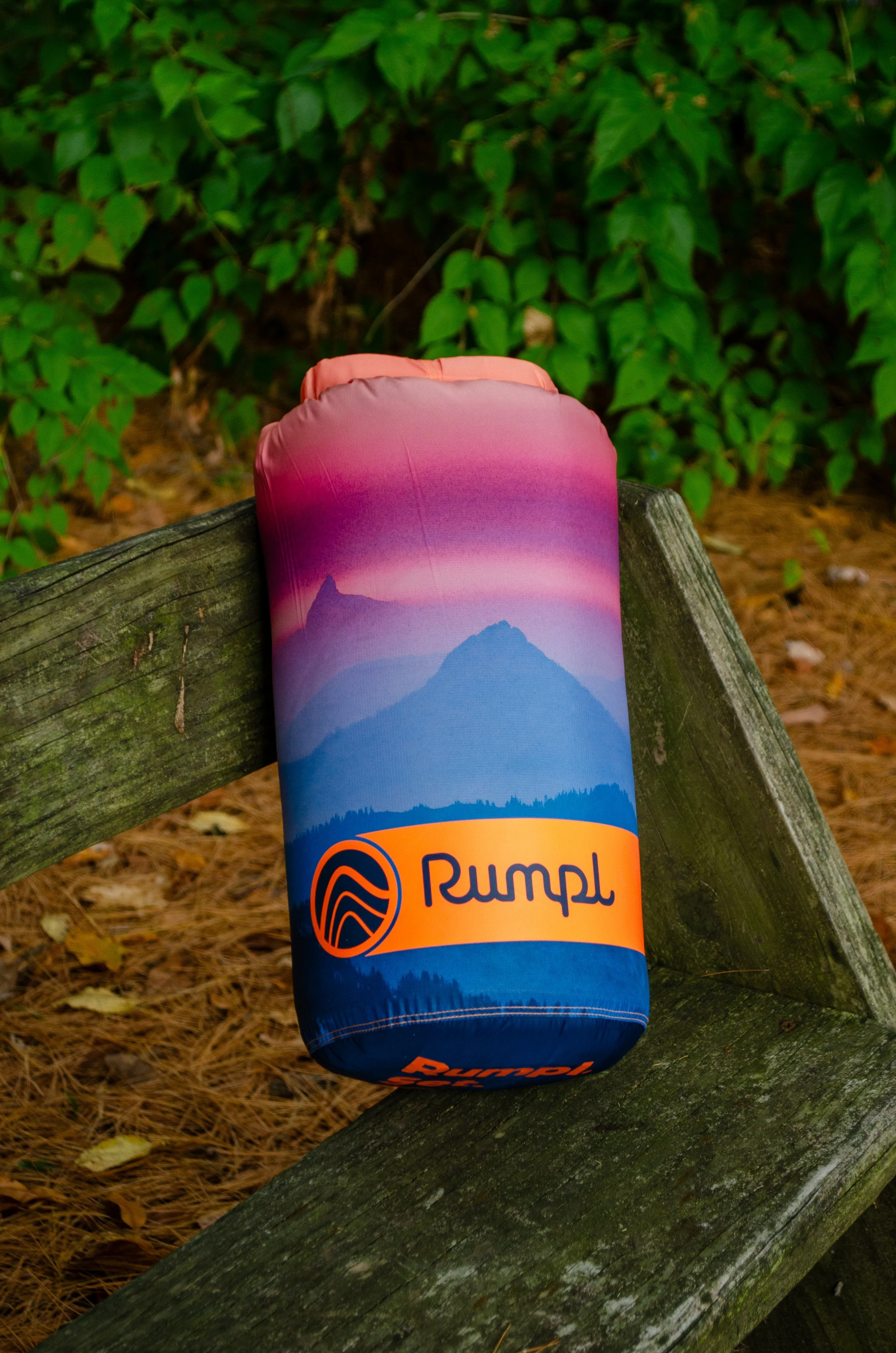
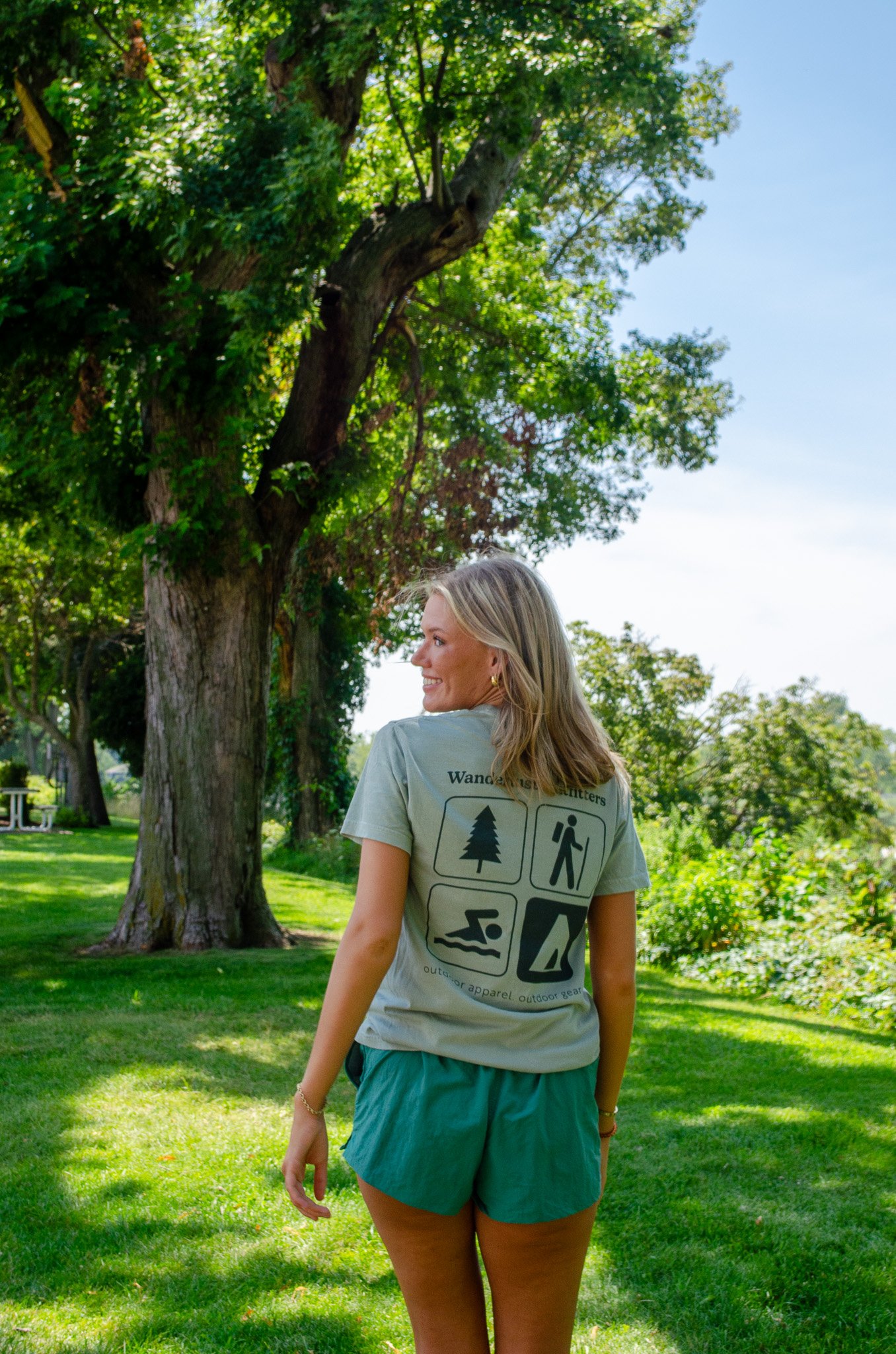
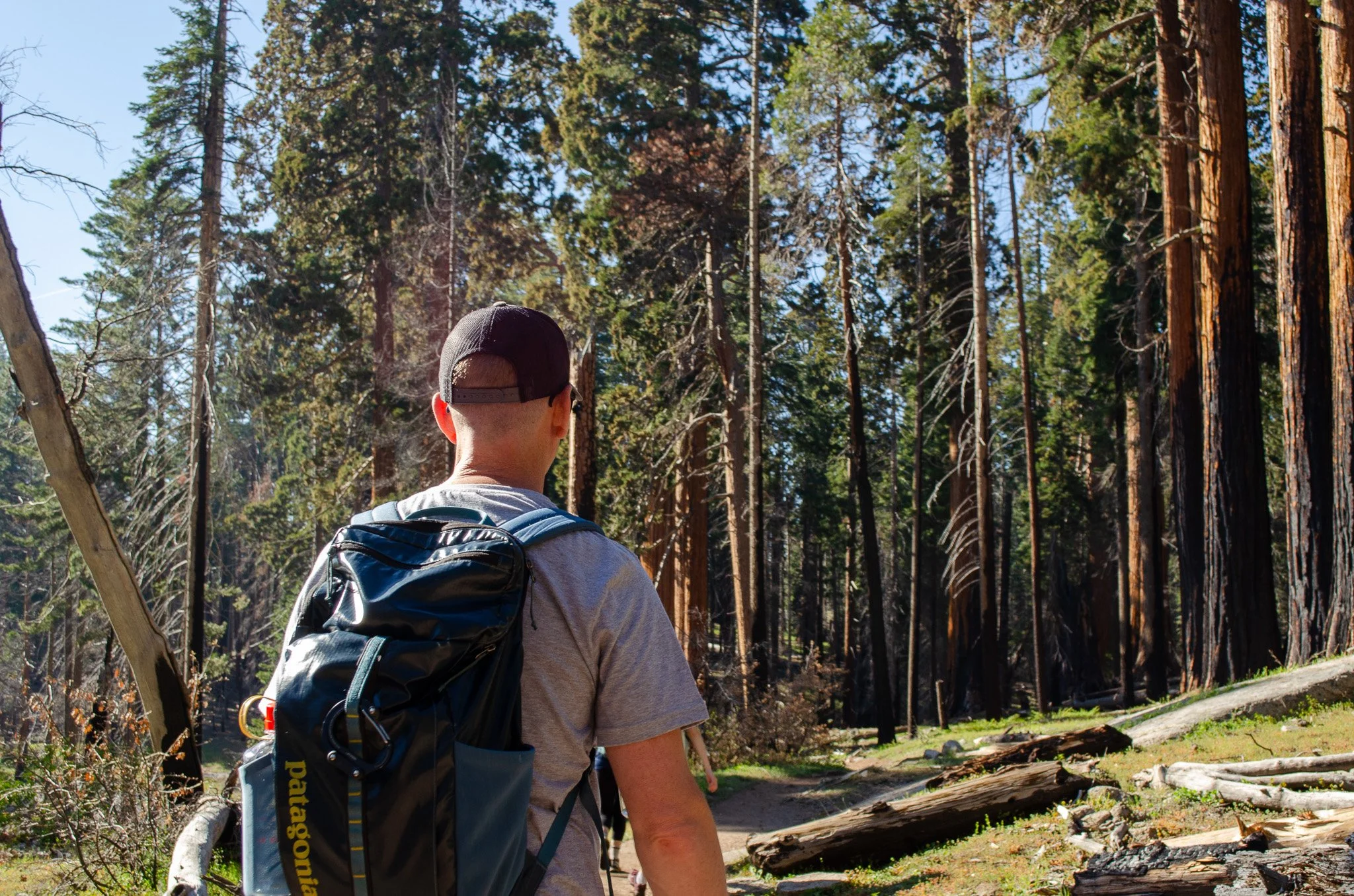
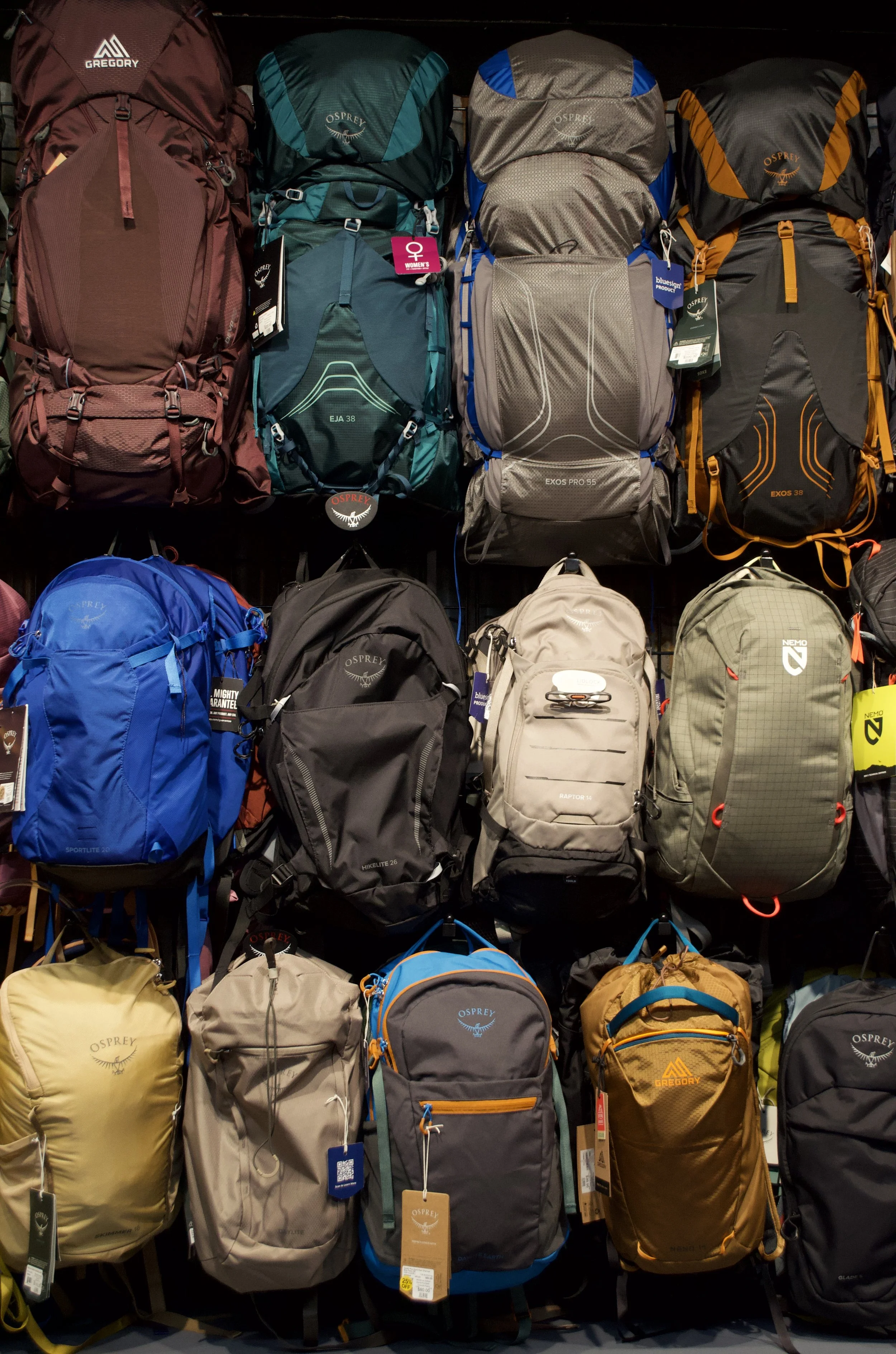
Photography is where everything started for me. Before the grids and the websites, there was just a camera and something worth noticing.
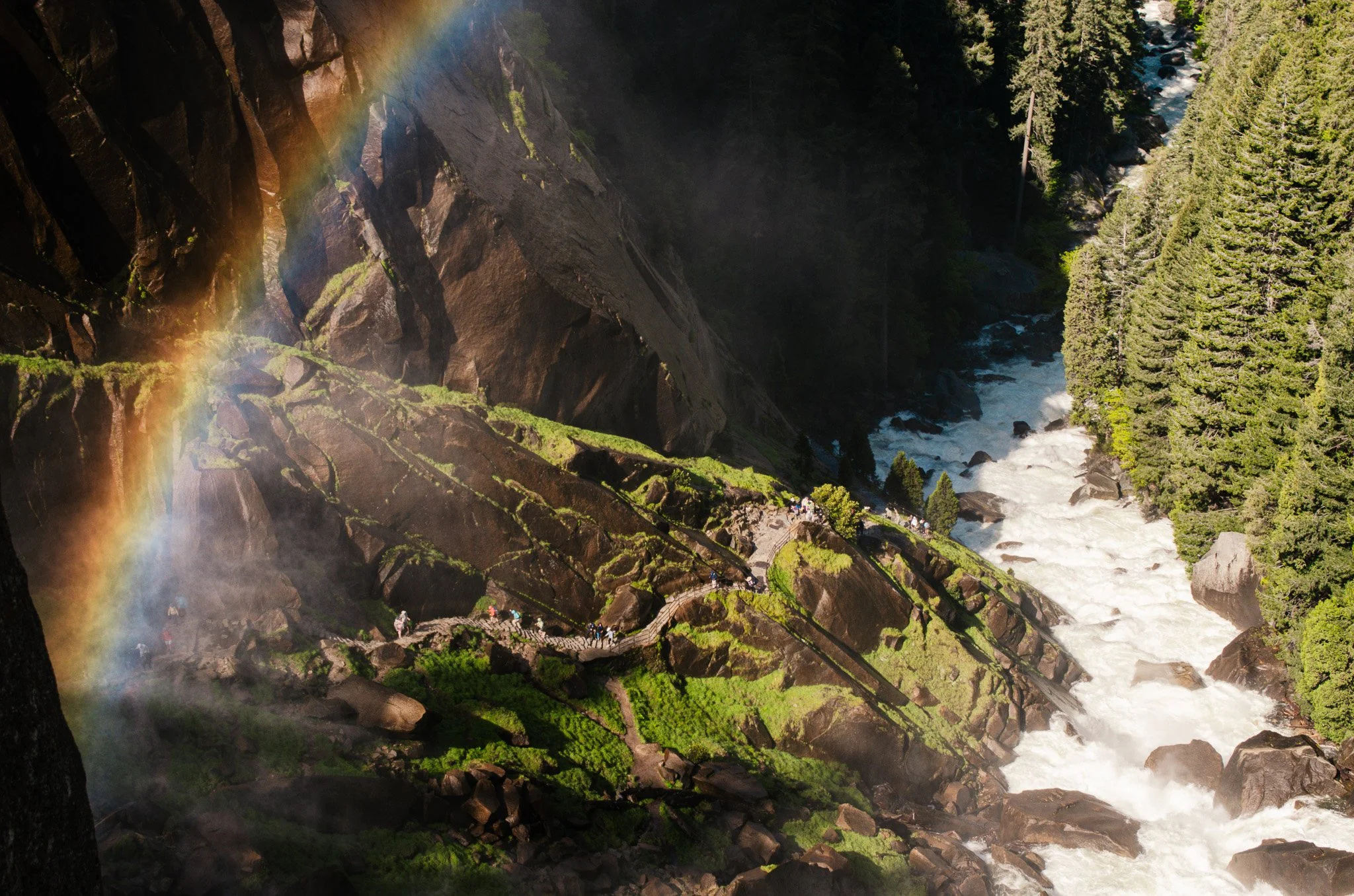
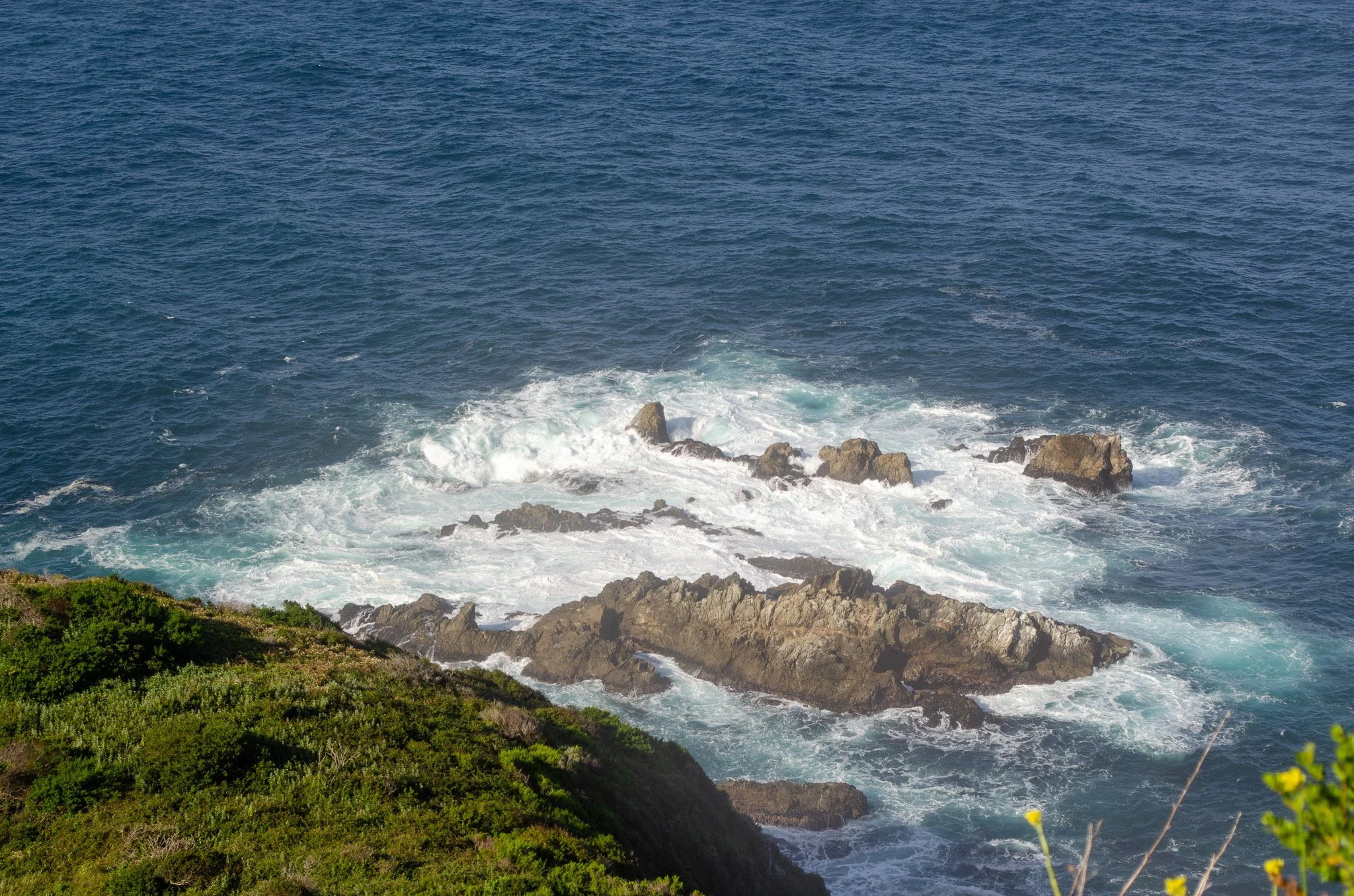
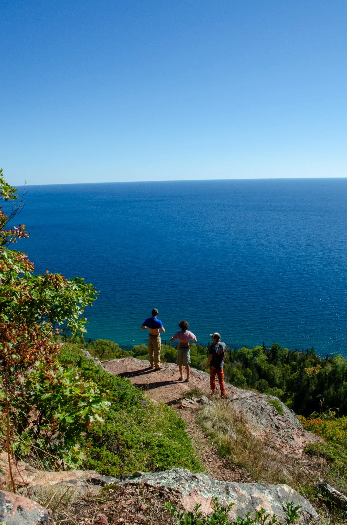
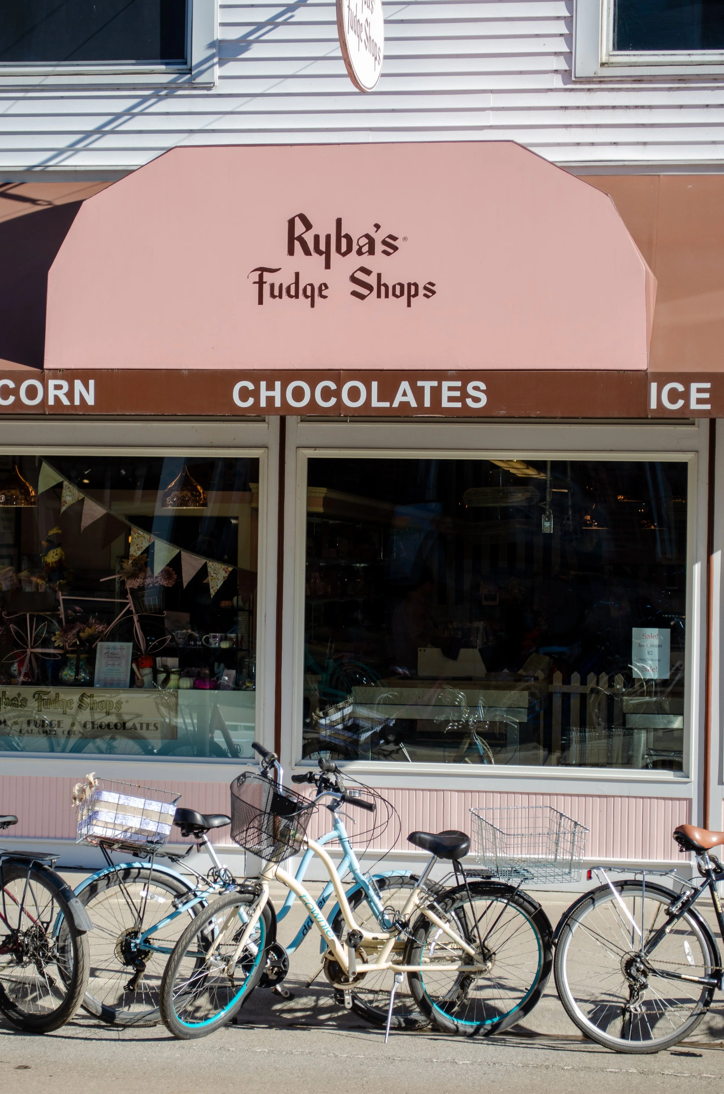
I shoot nature, landscape, and product. The through line across all of it is the same thing that runs through the rest of my work: slow down, look closer. Natural light, honest moments, and compositions that feel found rather than forced.
Available for brand and product shoots on inquiry.
Marisol
Marisol is a concept brand built as a portfolio study: a luxury wellness resort on the West Coast, designed from the ground up. The project covered full brand identity from naming, color palette, and word mark to a nine-tile Instagram grid that brought the brand to life visually.
The goal was to build something that felt like a real brand, not a school project. Warm, organic, and intentional. A place that looked like it already existed somewhere along the California coast and had been quietly doing its thing for years. Every content decision, from the quote tiles to the photo selection, was made to reflect that same unhurried feeling the brand was built on.
Project included: brand naming, color palette, word mark design, content strategy, and Instagram grid design.
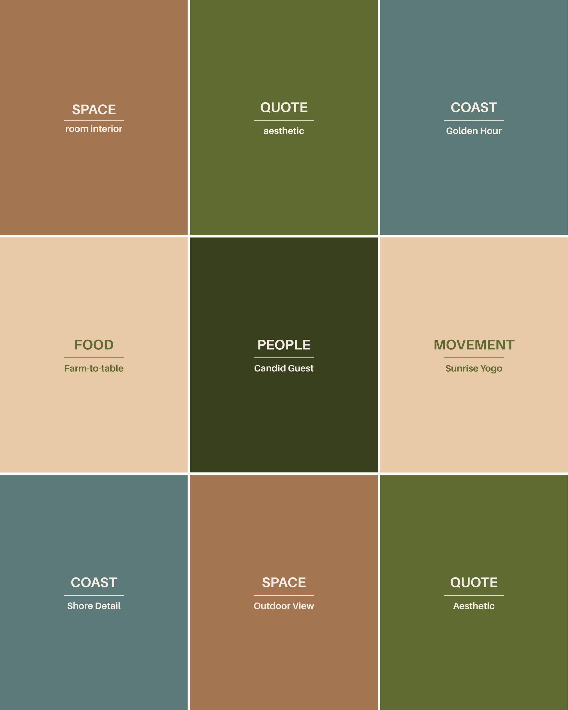
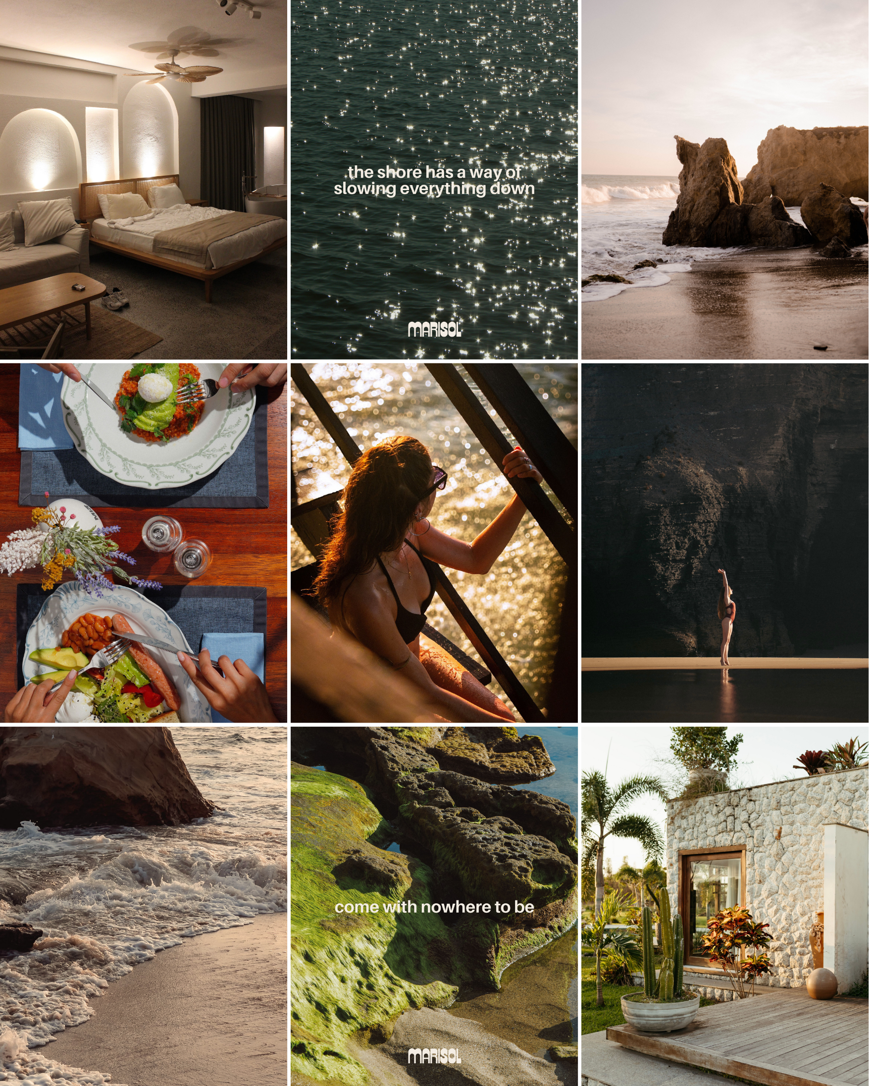
Marisol’s strategy started with a clear brand positioning: a West Coast luxury wellness resort rooted in organic curation and intentional rest. Every content decision that followed was measured against that positioning.
Five content pillars were established to guide creation: spaces, coastline, food, people, and movement. These pillars ensure that no matter what gets posted, the content always serves one of the core brand stories. They also prevent the feed from going flat or repetitive.
Delivery was planned with the grid layout in mind. Photo tiles were selected and sequenced to balance warm and cool tones, close detail and wide shots, people and place.
Everything answers to the same standard: quiet, warm, and considered. Content that breaks it doesn't belong in the feed, regardless of how good it looks on its own.